By Bec

Finally, I can reveal BeKKa Design’s latest kitchen makeover! As some of you know, earlier this year I downsized to a townhouse, and whilst the layout was great, the colours and functionality of the kitchen didn't really work for me. As soon as I saw this house I had an idea of exactly what I wanted to achieve to bring light and function to the space.
The kitchen cabinet carcasses, benchtop, sink and tiles were all in excellent condition, so it was just a matter of making a few small functional cabinet changes and updating the cabinet doors with a new colour.
Functional Changes:
Overhead cupboards

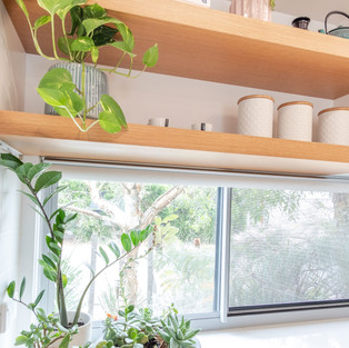
Whilst overhead cupboards are great for storage, I really love open shelves. Because it’s a small kitchen, I wanted to keep as much storage as possible, so I just removed one cupboard and replaced it with two open shelves. Doing this brought some interest to the kitchen design and also provided a space where I can have my favourite cookbooks and storage canisters on display as well as plants to soften the space.
Drawers v Cupboards

Personally I prefer drawers over cupboards in the kitchen, they just make it easier to see everything you have. However, I didn't want to waste the perfectly good cabinets that were already in the kitchen. So I removed the one existing set of drawers as well as the cupboard next to it and replaced them with a wide, deep set of drawers that holds all the cutlery and utensils, crockery and pots and pans. This has been a game changer in this kitchen design. Why? Because it's positioned directly next to the dishwasher, so when unloading most items go either in this bank of drawers or in the overhead cupboard directly above the dishwasher.
Appliance Cupboard and Pantry

The original kitchen had a pantry with a broom cupboard next to it. In terms of kitchen storage, the broom cupboard needed to go as kitchen storage is worth so much more. I have a lot of appliances, and to keep them from cluttering up the kitchen benches, I turned the existing pantry into an appliance cupboard and turned the broom cupboard into a pantry.
Appliances
I replaced the existing builders range appliances with new Fisher & Paykel appliances. Initially I was going to keep the existing appliances, but they just didn’t function well. I do a lot of cooking and food prep, so I need appliances I can rely on. I selected a white dishwasher and white oven to create an almost seamless line.
I had also intended to have an integrated fridge, but the cost doesn’t warrant the space it’s in. As I mentioned, I cook and prepare all my meals from scratch, so I selected the Fisher & Paykel Quad Door fridge/freezer. The bottom left area can be turned into a fridge or a freezer, and given I only really freeze fruit, the extra fridge space is priceless for me.
Finally, I put in a new goose neck tap from Abey as the existing tap was very low, making it difficult to put large pots and pans into the sink. Because I have kept the existing stainless steel sink, I chose a stainless steel tap to blend in.
Aesthetics:
Colours

With the remainder of the kitchen cabinets, all I did was change the doors to a different colour. The overhead cupboards are Polytec Classic White Ash Grain to add some texture, the bottom cabinets are two-pac finish in Dulux Lexicon quarter to match the wall colours, and to add a pop of colour and more texture, the cabinets around the fridge and pantry are two-pac custom VJ in Dulux Grey Pail.
The open shelves are finished in American Oak Veneer to match the new dining table. I chose two types of handles - American Oak feature handles for the pantry and laundry doors, and white ledge handles for the kitchen doors and drawers. Both handles are from Linea Standard.
Lighting and furniture

To finish it all off, I updated all the downlights and added two new rattan pendant lights from Temple & Webster to sit over the new dining table. As the space is an eat-in kitchen, I opted for a bar table at the same height as the benchtops, with stools that tuck in nicely underneath. Being at this height the table also serves as extra prep space. This beautiful dining table and stools are custom made by Green Cathedral.
Finishing thoughts
I'm so happy with this kitchen makeover. It really has changed the whole feel ofthe house, creating a real sense of calm as you walk through the front door, brightening up what was a dark space. Whilst the functional changes were small, they have made the world of difference to the use of the space. A big thank you to Rainer from RVS Kitchens for his beautiful workmanship.
What do you think? We love it and hope you do too 😊


Comments